hidden
./FLY UX./

./The brief
As part of my diploma in User Experience, I was required to carry out a complete UX exercise for a hypothetical airline company, from conducting user research to creating prototypes and wireframes that could be handed over to developers. Thanks to these practical assignments, I gained a very good understanding of and hands-on experience with the full UX cycle.
./Research
User Surveys
To start gathering user data, I put together a 6-question survey about people's online booking needs, preferences, and behaviours.
- Visiting an airline website was very common pre-Covid (50% visited a website in the last week).
- Most common goals were to book a new flight or check-in.
- Price and flights availability were the main search criteria
- Most extras are overlooked and unneeded.
Important insight:
- Most users refer to aggregators to find best options.
- Users want to see the prices as soon as possible, also would like a breakdown
- Extras and Ads are cause of frustration for users (too many clicks to confirm either Y or N)
"Asking for health insurance for the trip it's okay, but the pages to book a car and/or hotel are annoying."
- Survey respondent
Benchmarking
To get a clear idea of the conventions adopted by other travel companies, I conducted a competitive benchmark analysis of 3 other direct competitors apps, and one aggregator: Virgin Atlantic, Alitalia, EasyJet and Kiwi.com.
At each screen/stage of the booking process, I pinpointed positive points as well as roadblocks, and took note of similar traits and conventions used. At the end I collected some of these points to give a clear summary of the experience of each solution, to use the information going into my design.
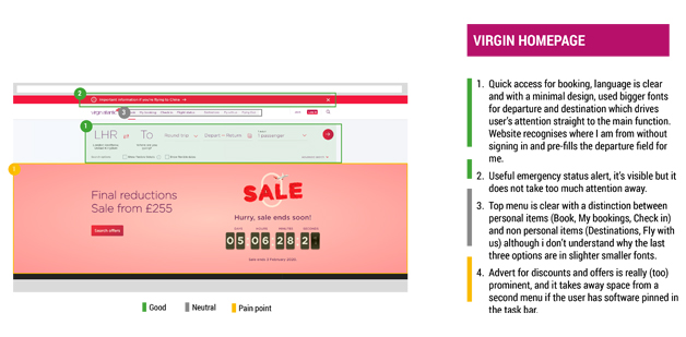
"A good general layout with minimal graphic style, it recognises my location but on the
homepage too much space has been dedicated to offers/adverts.
The initial selection of
flights/dates is pretty straightforward, however the system fails to give guidance when dates
are not available, and also the search for airports is not up to standards.
The recap page seems a bit redundant as it shows
almost the same information as per previous screen."
- Extract from Virgin Atlantic benchmarking notes
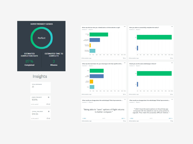
Note taking and Usability tests
To obtain more qualitative data, I set up two usability tests for both website (see video on the right) and mobile, in addition to the ones provided by the client. My role included both note taking and moderating the sessions. The task they had to perform was to autonomously book return flights for them and a companion.
The results confirmed that users are generally frustrated by ads and extras, there was confusion over cabin benefits and language used (Avios points for example) and the need to learn new conventions. Stopovers weren't always clearly labelled.
- Note taking extract from a usability test -
| Note taker | Alessandro Boaretto |
| Screened Apps | Air Lingus and Eurowings |
| Tester | Male - Hospitality Manager - Raheny (Dublin) - Age: 30-ish |
| Internet access | Broadband, via (mostly) Mobile phones, laptop |
| App installed | Dating Apps, Travel (Skyscanner, bus, trains, taxi, booking.com, Go There, Aer Lingus, Trip Advisor), Amazon, Kindle, Netflix |
| Type of flyer/frequency | Travels for business (Dublin - London) and leisure (at least 3 times a year) Paris, Berlin, Reykjavik, Barcelona |
| Aggregator websites | Yes, Skyscanner most of the times |
| Last experience on booking flights | For work (training course) He booked for 4 people - multiple bookings:
Dublin - London (he was quite short on time so he booked via his phone) he went through Skyscanner and found the cheapest option on Ryanair (outbound) and Aer Lingus (inbound), He initially booked for him and another colleague as sent the QR code for boarding passes to other two (Aer Lingus) as they were new joiners flying a day later. For business main concern is timing and then price. For personal travels as well (he would be happy to pay a bit more if timings were more convenient). |
"Micheal was really confused on whether or not the flight was direct as there was no information that he could see regarding a
stopover. If he hadn’t wanted to choose seats right at the booking he wouldn’t have known about it.
He liked how the App showed
the differences between fares. But he feels one has to have previous knowledge with the App to know it.
He wants the stopover to be more clearly communicated and detailed."
./Define the issues
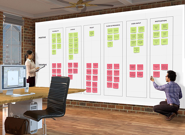
Affinity diagram
Once collected enough data (is it ever enough?) I reviewed the material and proceed to organise it in cards following the K-J method.
As I went through each document I looked for pain points, mental models, positive features, user primary and secondary goals and context. I wrote a single detailed observation per sticky note and grouped them together.
Thanks to online tools like Miro, it was easy to organise my notes into color-coded groups:
- Flexibility
- Choice
- Trust
- Flow and Progress
- User input
- Motivations (goals)
For each group I also split the cards in positive and negatives.
"I would like to take a moment and ask you to join me in congratulating Alessandro for obtaining his Professional Diploma in User Experience (UX) Design. Doing all of that extra work while continuing in his full-time position was extremely ambitious and took a lot of effort and dedication on his part, well done!"
- Gary, former Comms Director, PRI
Customer Journey Map
After creating the affinity diagram, the next step was to build on the findings by compiling a customer journey map where all the data gathered until this point, is mapped against the user flow (from let's go on a trip, to payment and review).
For each stage I isolated goals, behaviours, mental models and context, alongside positive and negative points (roadblocks).
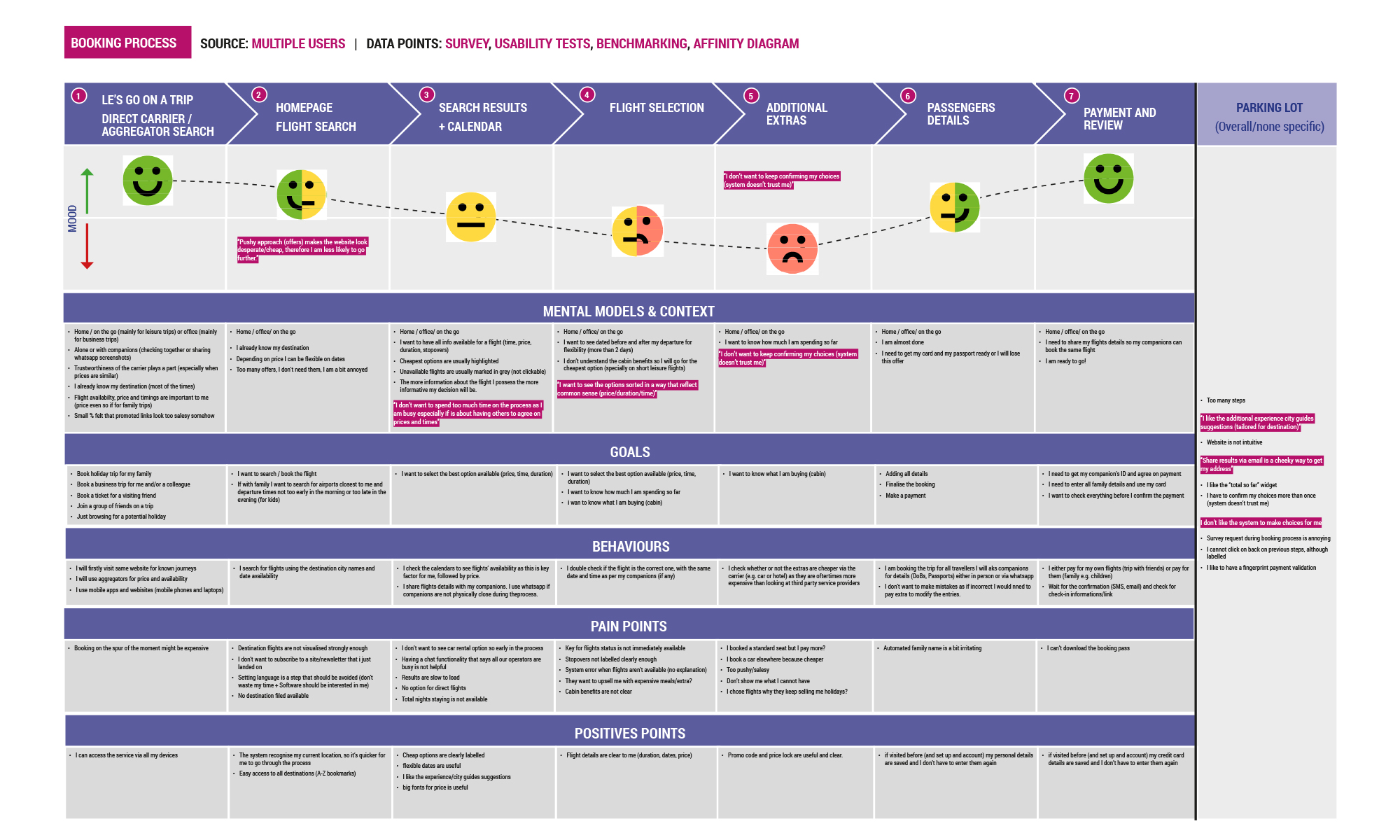
“I like the additional Experience City guides suggestions (tailored for destination)."
- Customer Journey Map
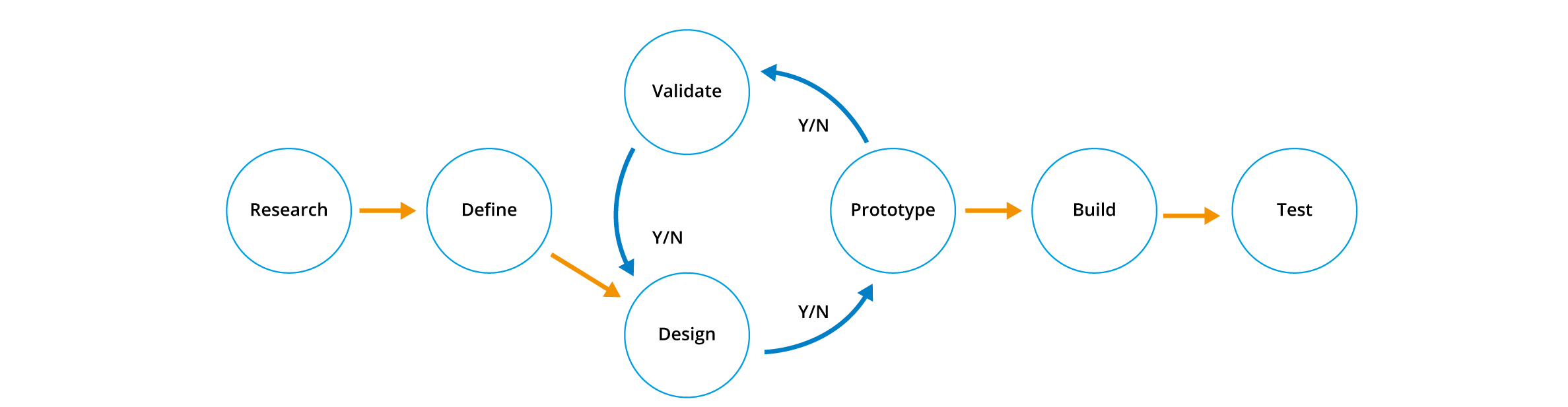
./Design a solution
Flow Diagram
Time to put all the data gathered to work. Before designing any screens, I laid down the main flow (from booking to seat allocation). I had to consider each step the user would take and design each screen, state and interactions. This exercise was done for both desktop and mobile.
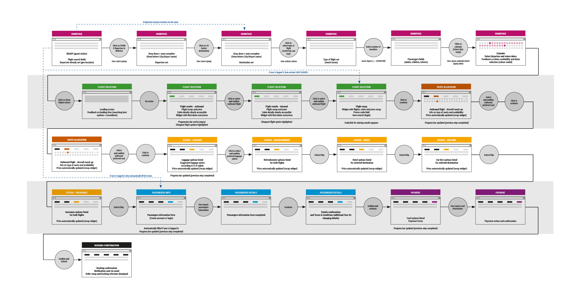
“If user is logged in, then activate Save search in Flights recap screen."
- Extract from the Flow Diagram
Interaction design for Desktop
After finalising the main flow and Architecture information, I moved forward to sketching the main screen states. I collected all the research findings and poured them into my sketches to solve the users issues. My goal was to ensure that every step would aid users in achieving their goal of easily finding, selecting and purchasing low-cost flight tickets.
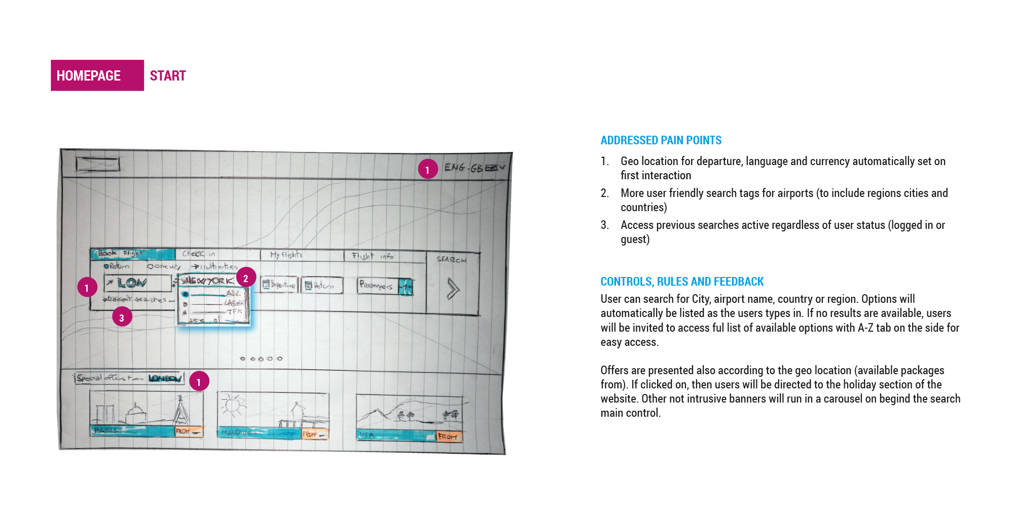
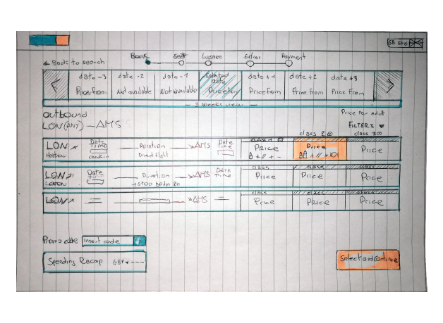
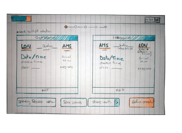
"Your interaction design sketches are great! You've included a huge amount of detail.
The annotations and the extra contextual information are well laid out by numbering and have the text on the right hand side. It makes the document easier to read and navigate!"
- Rebecca, UX Design Institute
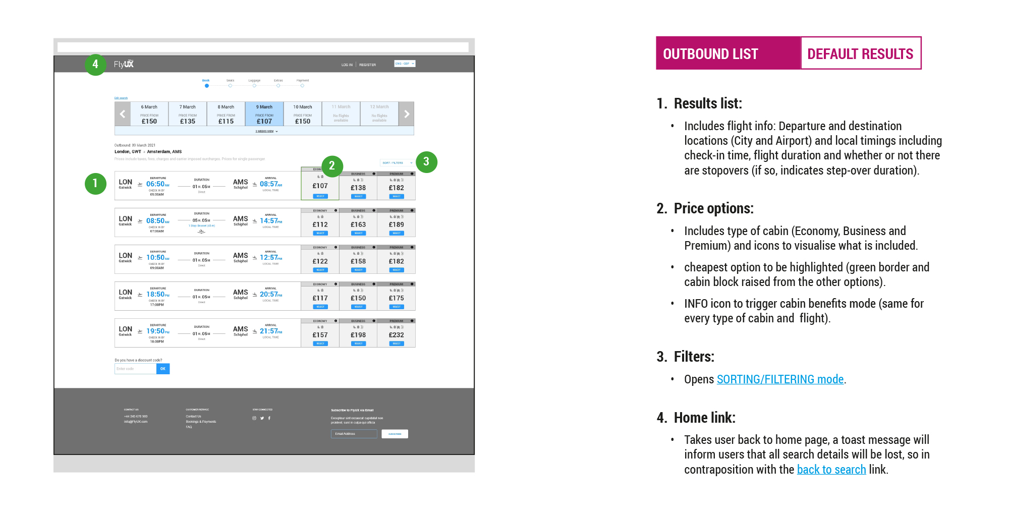
Mid-fidelity prototype
Once any potential issues were identified from the low-fidelity prototype, I developed a more detailed prototype using Adobe XD. A reduced colour palette allowed me to focus even more on the structure and architecture of the screens. Have a decent amount of details meant that during the testing phase users were able to navigate through the flow as they would on a live website.
“You got a really nice fidelity prototype. The subtle use of colour really helps the CTAs stand out. One area I got a little confused was picking the first flight, but the suggestions of looking at the weeks and sorting by direct flight aided the process."
- UX Design Institute
Wireframes
For the final step in the UX process, I described all the actions and rules that define the interactions into wireframes. This is essential to avoid any misunderstanding and to share all the necessary information with the developers.
Creating the final wireframes was particularly interesting as all the pieces came together with all research insights in mind and nothing was left to chance.
“Really clear and detailed wireframe. With this I would be able to build a working product without spending time doing guesswork."
- Richard, Website Developer
./Takeaways
Personally, it has been immensely satisfying to witness the culmination of my efforts. The positive feedback I received from both teachers and external professionals regarding the prototype and wireframes filled me with a sense of accomplishment.
One of the most valuable takeaways for me was the importance of extensive research. By incorporating all the insights gathered during the process, I realised that great design solutions can emerge. I discovered the significance of effectively transferring user pain points, goals, and contextual knowledge to the affinity diagram and customer journey, as it saves valuable time during the design phase and eliminates the need to constantly refer back to usability tests and notes.
Additionally, I learned the power of sketches as the initial wireframes. They served as a pivotal tool, allowing me to uncover hidden points and evaluate the effectiveness of the information architecture. It was a constant reminder of the importance of thoroughness and attention to detail throughout the design process.
Overall, studying while working proved to be a challenge. However, I am exceptionally pleased that my dedicated efforts paid off, allowing me to acquire invaluable skills and insights in the field of UX design.